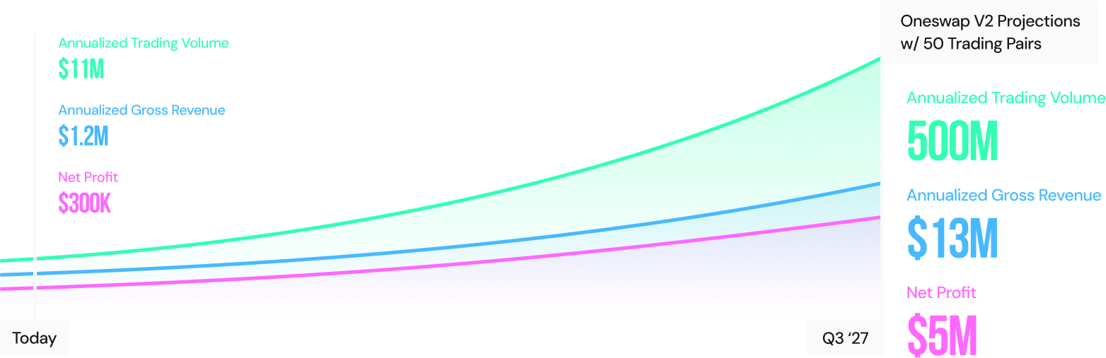
A simpler way to trade on Canton
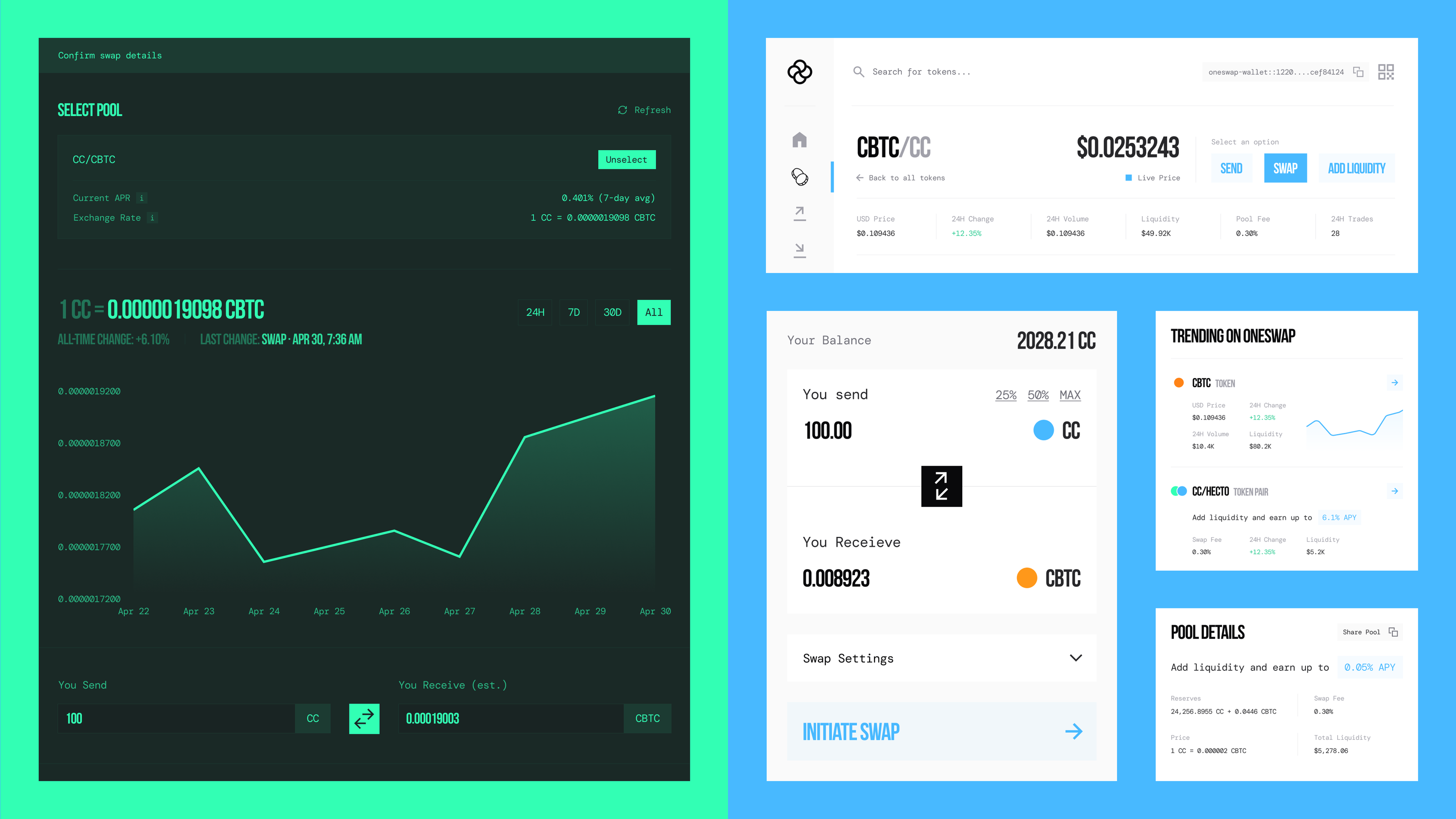
Designing for a broader market
OneSwap is a decentralized exchange and automated market maker built for the Canton Network. I designed its product experience and visual identity across two major versions, from an expressive exchange aimed at retail traders to a more unified platform intended to serve a broader market.
The challenge changed as the product grew. Initially, I needed to turn a loose brief into a working exchange experience quickly. Later, I needed to make more functionality feel like one product, while refining the brand for an audience that increasingly included institutional participants.
Starting with a blank canvas
The first brief was simple: build a decentralized exchange and wallet experience for people trading and speculating on Canton, and get a prototype ready quickly.
The team had defined the core capabilities, but not the flows between them or how the product should look and feel. I had considerable freedom to establish both. With little time for extensive iteration, I relied on my judgment to shape an experience that made the trading actions clear and gave the new product a distinct identity.
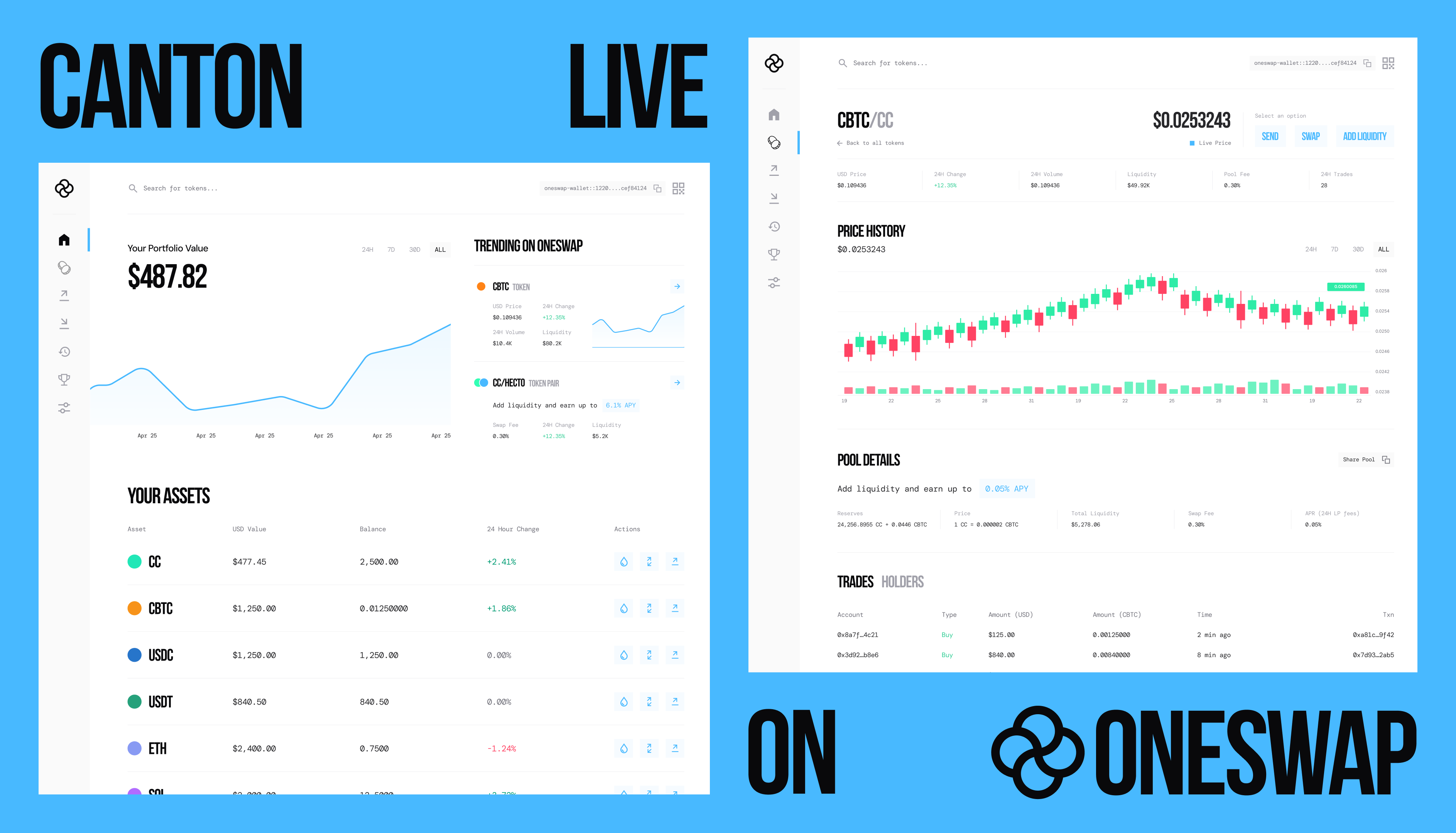
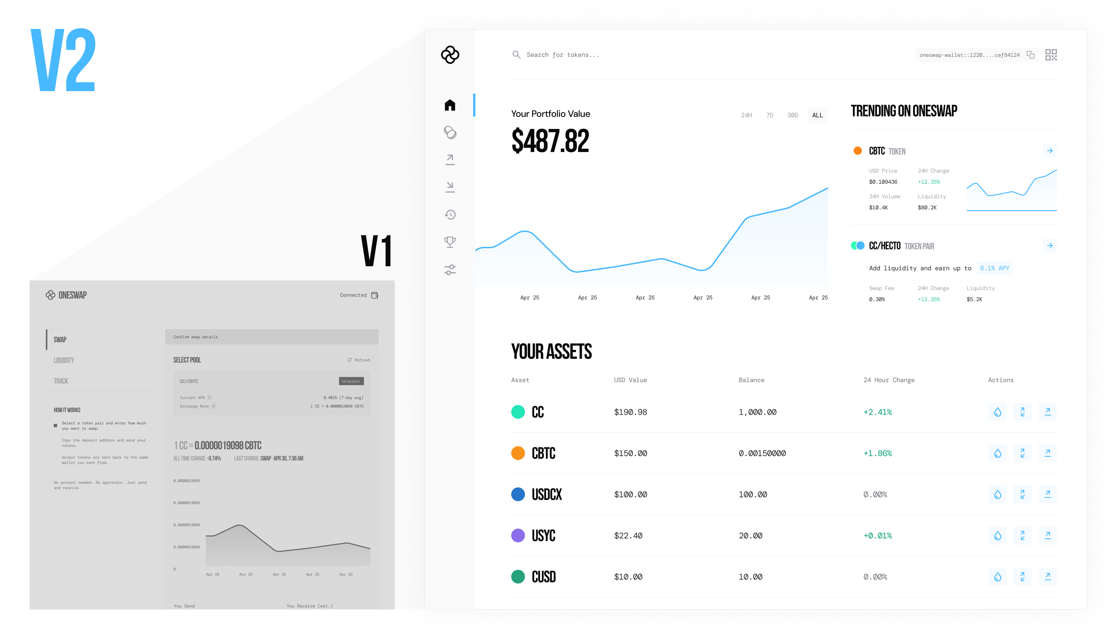
V1 was deliberately bold. I used a monochromatic visual approach with recognizable green, pink, blue, and yellow themes, leaning into the energy of retail trading culture. The design was focused on specific actions, including swaps and liquidity, rather than trying to behave like a comprehensive financial platform from day one.
That was an intentional starting point, not a direction that needed to be discarded.

A broader ambition
As OneSwap's ambitions grew within the Canton ecosystem, the team decided to bring its wallet and exchange together. The opportunity was bigger than a standalone swapping interface: the product was moving toward a connected environment for assets, trading, and liquidity, with institutions joining retail traders as an intended audience.
That shift created two related design problems. First, adding functionality could easily make the experience feel fragmented. Second, the brand needed to feel credible and considered across a wider range of financial activities without losing what made OneSwap recognizable.
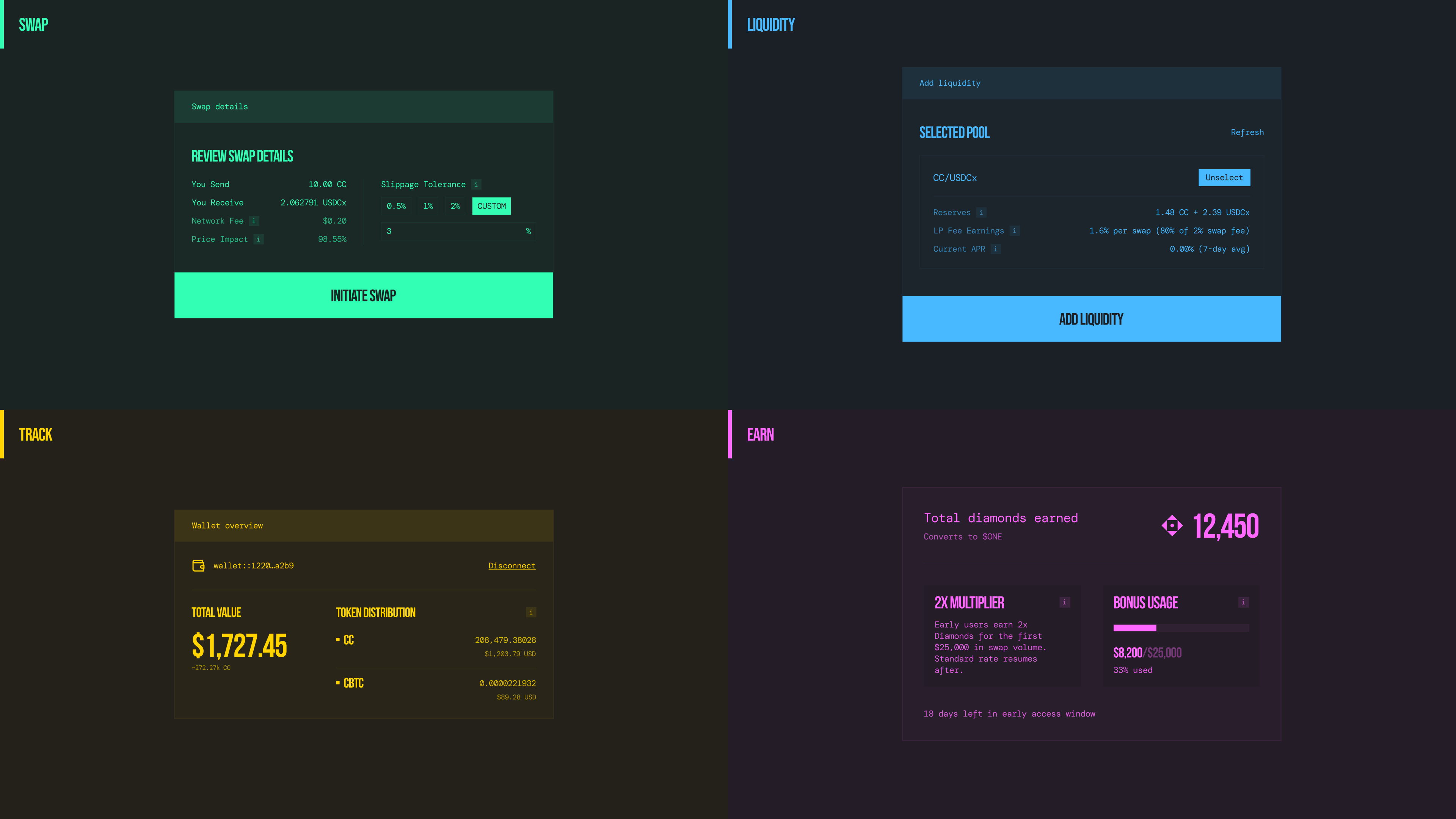
I approached V2 as a refinement rather than a reinvention. I kept the typographic foundation and distinctive brand colors, but changed how they were used. White backgrounds, more space, and a more deliberate hierarchy gave the product room to accommodate richer information. The stronger color treatments remained part of the brand, especially on the landing page and in marketing, while the application used them more selectively.
The goal wasn't to make OneSwap less bold. It was to make that boldness more intentional.
Designing around assets, not isolated actions
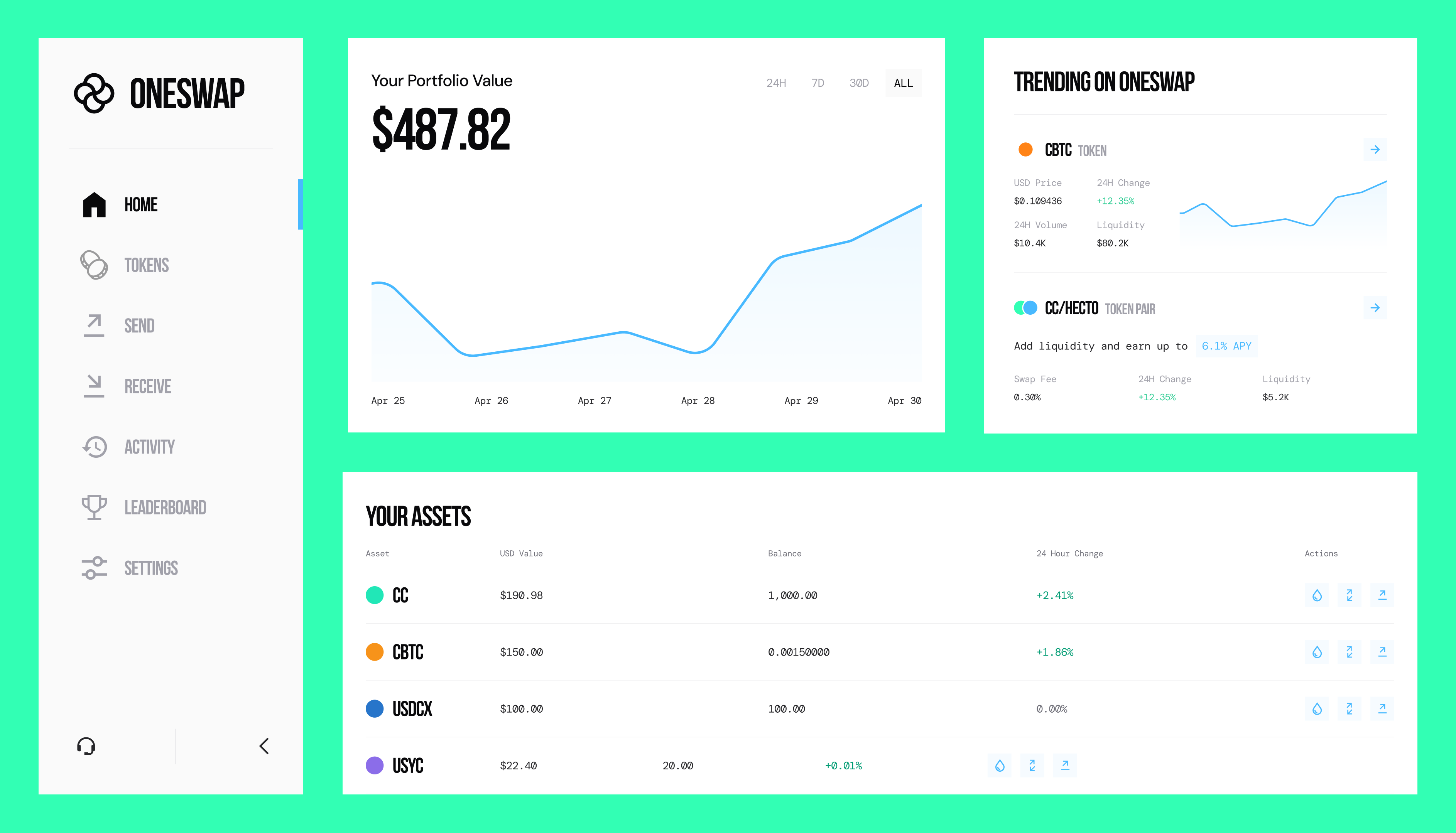
The biggest UX change was how I organized the growing set of capabilities. Instead of giving every activity its own destination, I looked for ways to group related information and actions around what users were actually working with.
A home for discovery and context
I also broadened the role of the home page. Trending assets introduced a way to discover activity in the market, while portfolio information helped users understand their own position. Rather than acting only as a route to individual trading functions, home became a starting point for exploring and managing the platform.
One coin, multiple possibilities
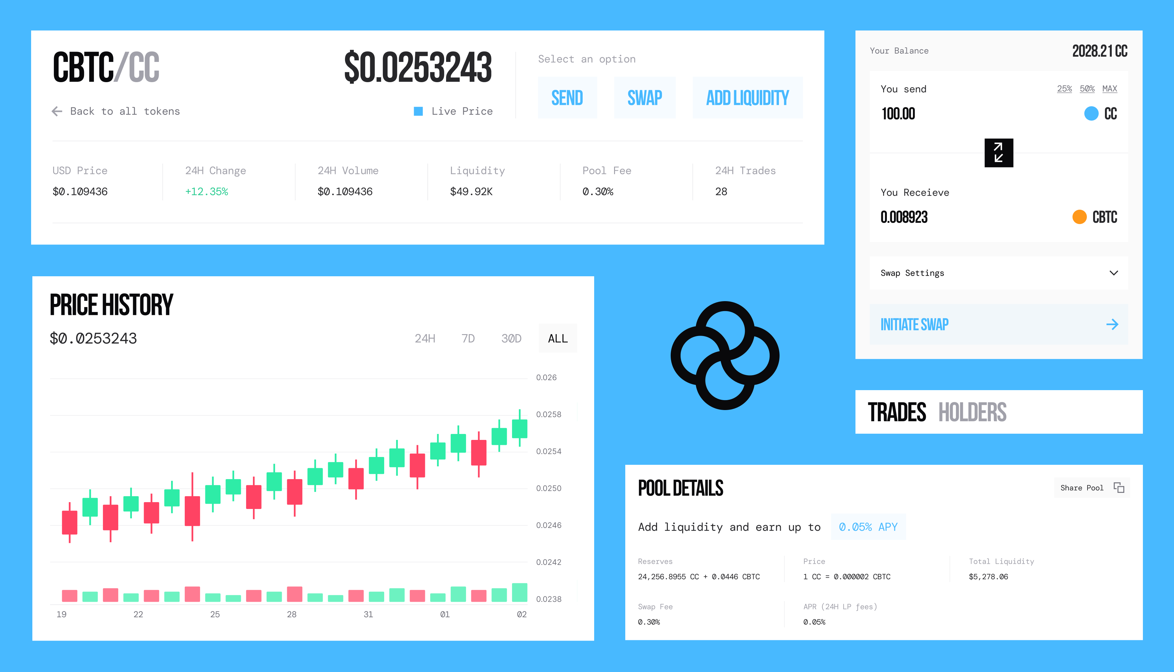
In V1, liquidity had a dedicated page. In V2, I designed individual coin pages as destinations for understanding and managing an asset. A user could review price history and pool information, then choose to send, swap, or add liquidity from the same context.
This served two goals at once: simplify navigation and make each coin page genuinely useful beyond a single transaction.
The trade-off was density. Bringing more functionality together only works if users can still understand what's important. I used hierarchy and an options panel to keep actions available without making every action compete for attention at once.
A wallet that's always within reach
Consolidating the product also meant that wallet information needed to remain accessible across different tasks. I designed an expandable wallet component that could stay present throughout the experience without taking over every screen.
Together, these decisions reflect the same principle: give users more capability through shared, understandable contexts instead of multiplying pages and navigation paths.
A foundation for what comes next
Both versions of OneSwap shipped, along with the supporting brand and marketing work I designed.
What I value most about the evolution is the foundation V2 established. The product could accommodate more information and actions without making each new capability feel like a separate tool. At the same time, the identity could flex between expressive marketing and a calmer, more spacious application without losing its character.
The lesson for me was that a product doesn't have to become visually or structurally more complicated as it grows. The more its capabilities expand, the more important it becomes to decide what belongs together, what deserves attention, and where the brand should speak the loudest.