
A shared foundation for Bitcoin finance
I redesigned a platform for borrowing against Bitcoin and designed its companion product for earning on deposits, with shared patterns for funding, reviews and account management.
Making Bitcoin-backed borrowing understandable
Borrowing against Bitcoin means making decisions about collateral, interest and liquidation while navigating wallets, bridges and lending protocols. Sats Terminal brought those capabilities together so people could compare loans and borrow stablecoins against their BTC. My job was to make the decisions inside that process understandable.
As Founding Product Designer, I redesigned the Borrow experience, established its visual and interaction foundations, and extended those patterns into Earn. My work covered entry, funding, transaction status, loan management, repayment, withdrawals, email and mobile layouts.
The CEO helped set business direction. The CTO explained the technical workings of bridging, wrapping and lending protocols, grounding my designs in what the system actually did.
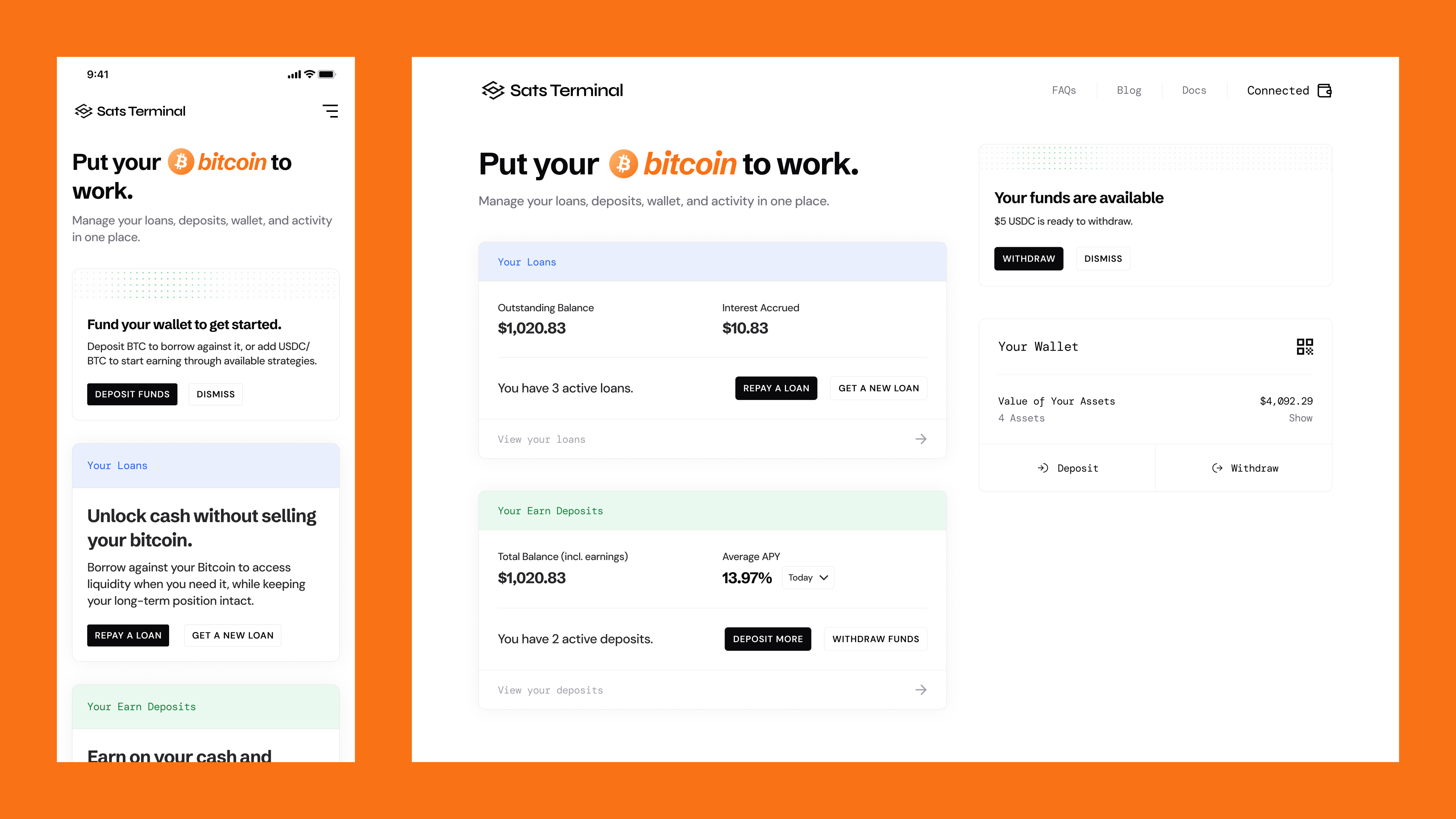
Establishing a clear product hierarchy
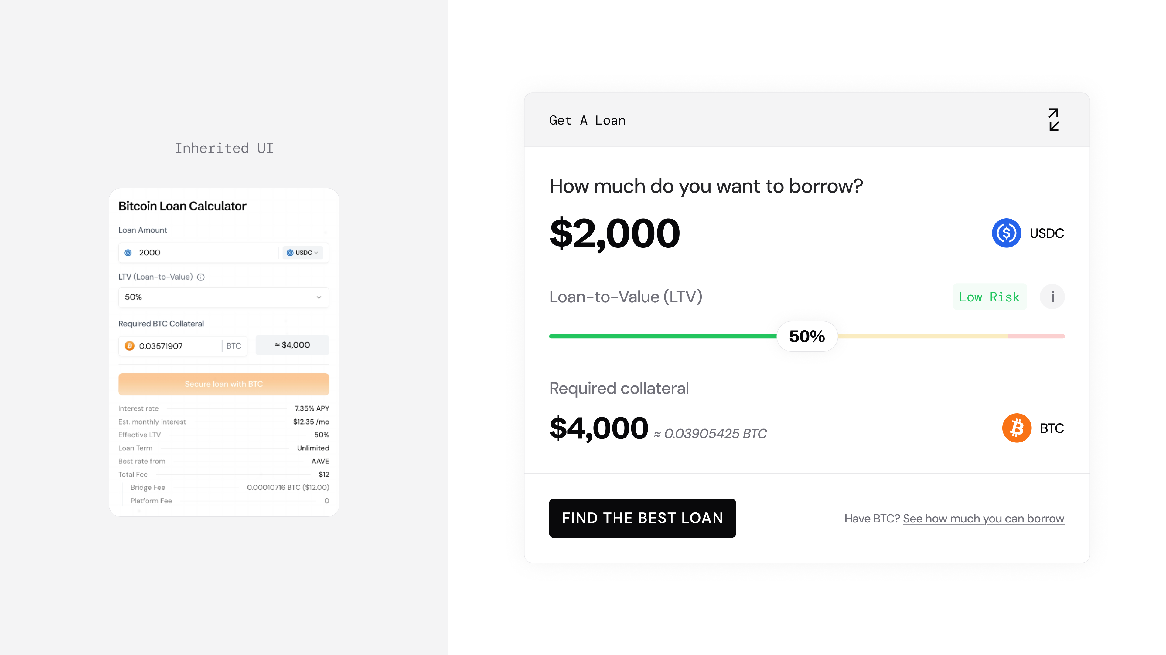
I inherited a working borrowing product. It already had a calculator, market comparisons, guided explanations and loan management. My initial audit focused on how those pieces were presented: competing controls made the next action unclear, technical wallet language needed context, and funding raised questions about where Bitcoin would go and what would happen next.
My first substantial assignment was to establish a more mature brand and redesign the entry point. I explored an explanatory landing page and a comparison-led approach. One gave more space to the proposition and guided configuration; the other brought loan options forward. Both needed a clearer relationship between the borrowing decision and the detail supporting it.
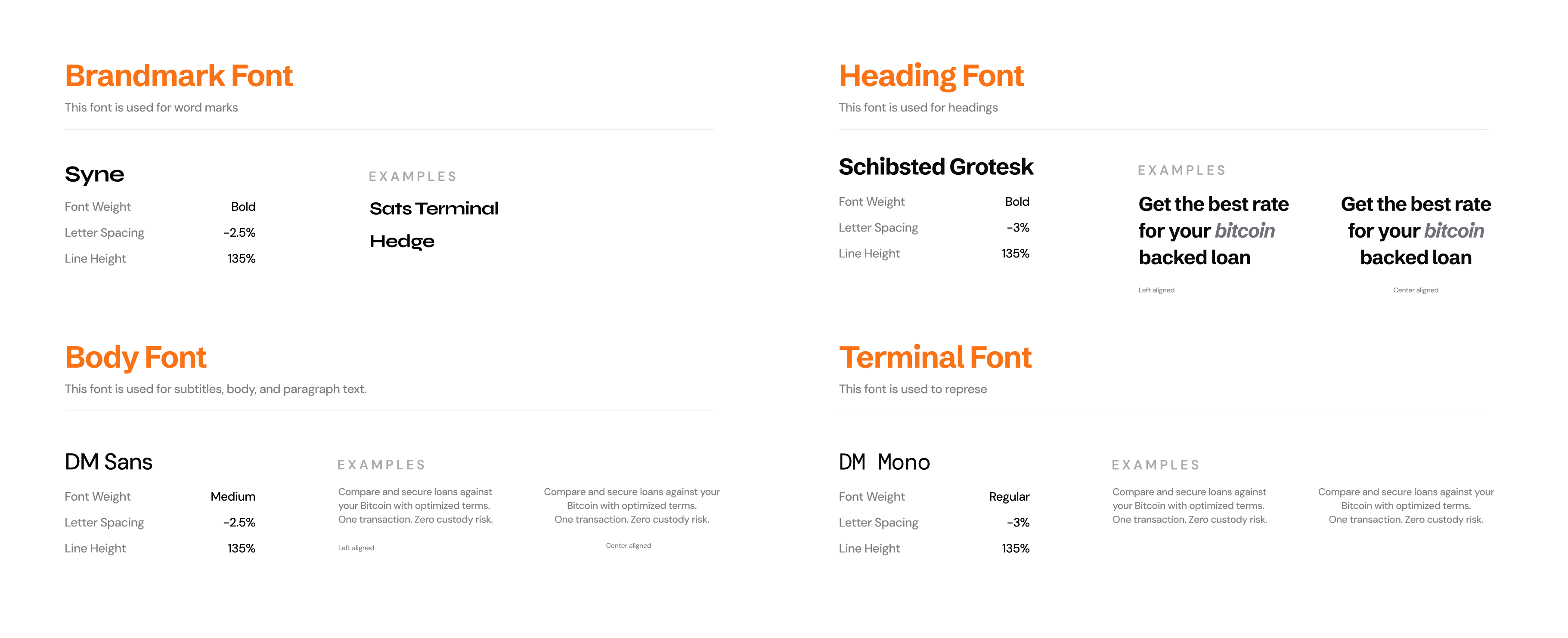
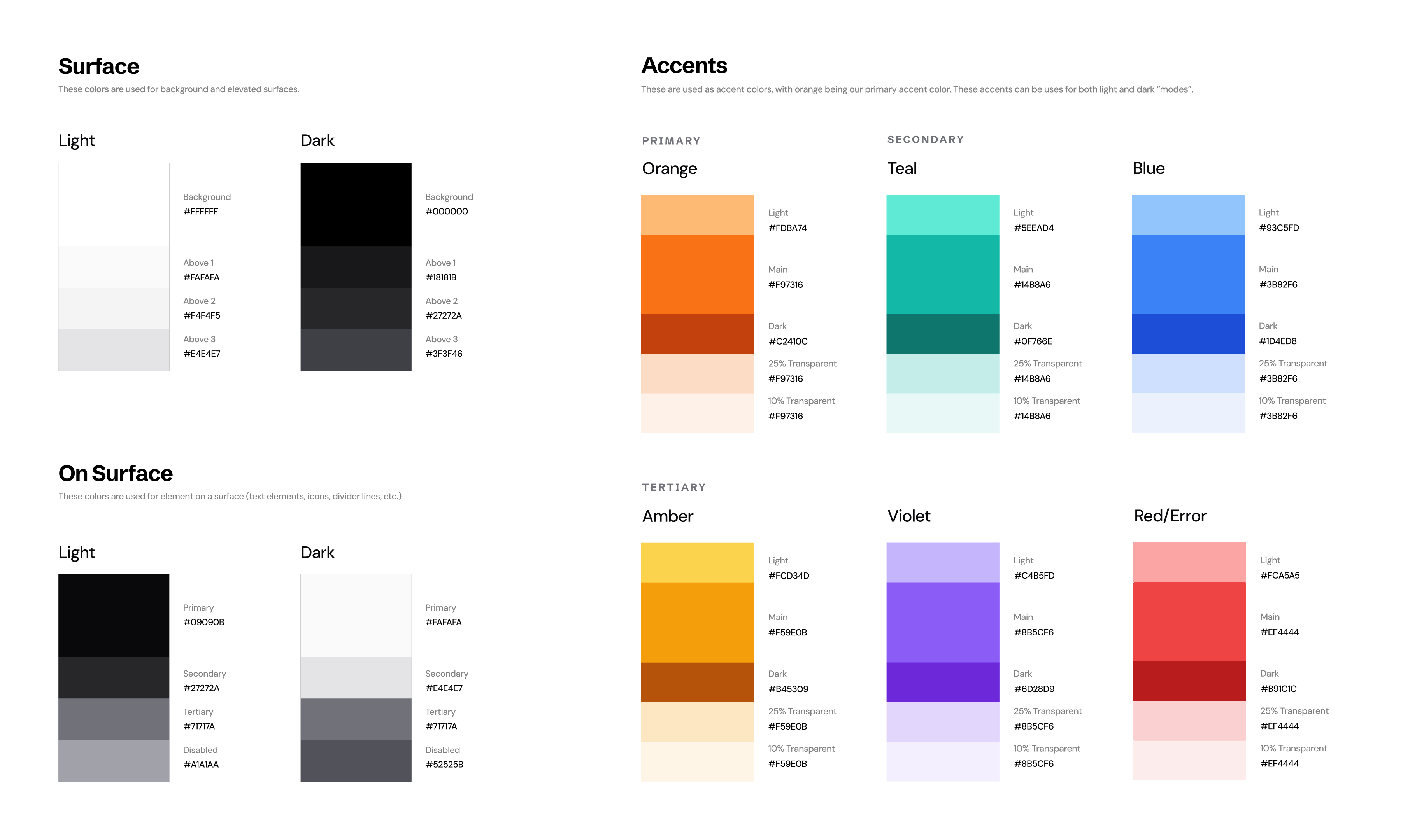
I developed typography, color and image-treatment rules, then carried those foundations through the complete Borrow redesign. Headed cards with greater visual weight identified primary tasks. Quieter, flatter surfaces held supporting information. This distinction gave the dashboard, offer evaluation, execution and emails a shared hierarchy.
The interaction patterns mattered as much as the styling. I designed two composer variants: one starting with the amount to borrow, the other with the Bitcoin available as collateral. Both kept the loan amount, collateral and loan-to-value ratio (LTV) linked. LTV expresses the loan amount relative to the collateral's value. During execution, I kept the loan summary visible while expanding the step that required attention.
Showing what financial actions actually change
Loan management needed more than an amount field and a confirmation button. Repaying debt and adding collateral can both improve a loan's health, but they change different things.
I designed repayment reviews to show the remaining debt, resulting health and collateral available to unlock. For collateral top-ups, I showed the change in collateral, LTV and liquidation price, with an explicit explanation that adding collateral did not reduce the amount owed.
That distinction shaped the review itself. The user needed to understand the consequence of the action before confirming it. It also shaped funding states: when the platform wallet lacked enough BTC, the design retained the loan-health context beside the deposit instructions.
Extending the model into Earn
After Borrow launched, I used the same foundations to design Earn while continuing to update Borrow. Reuse gave me a starting structure, but the financial decision was different.
Borrow began with liquidity and collateral. Earn began with the exposure the user wanted: maintain exposure to Bitcoin's price or earn through a stablecoin strategy. Strategies that converted funds into stablecoins belonged outside Bitcoin Exposure. Using BTC to fund a deposit did not necessarily mean the resulting position would move with Bitcoin's price.
I adapted the offer-and-composer layout, transaction stages and monitoring patterns around those differences. Earn needed to explain permissions, distinguish the asset deposited from the asset held, and separate the current variable annual percentage yield (APY) from historical information.
For V2, I gave Borrow and Earn the same final-review structure: three plain-language points alongside a numerical summary. Borrow explained collateral use, proceeds and ongoing loan-health responsibility. Earn explained the deposit, variable yield and withdrawal conditions.
I also connected the products at the moment loan proceeds became available. The completion surface offered withdrawal, earning and buying BTC as possible next actions. I placed Earn within the completion step so borrowers could consider it as a next use of their proceeds.
Bringing funding into the borrowing decision
After Borrow and Earn launched, we focused more closely on the route from the landing page into a loan. Team discussions identified repeated loan-start actions, uncertainty about the platform wallet and hesitation over where BTC would go.
I designed two entry variants. One went directly into loan initiation, keeping full details available through a link. The other consolidated the earlier details into one review before initiation. Both explored how to explain enough for someone to proceed without requiring them to understand the platform's infrastructure too early.
The V2 design addressed those same concerns through context and account state. I placed available BTC, required collateral and the remaining balance beside the composer. A funded user could see they were ready to review. Someone with a shortfall could see the amount missing and the deposit details needed to resolve it.
I also separated wallet funding from committing collateral to a loan. The first-time journey explained why a platform wallet was needed, showed how to send BTC, confirmed its arrival, and then led into review. The copy made clear that only the required BTC would be used. Existing users encountered connection or funding steps when their current state required them.
I originated the contextual wallet setup, funding-before-review and shared-review approaches, discussed them with the team in stand-ups, and received the CTO's approval. The trade-off was to defer explanations until they served an intended action while preserving an explicit review before commitment.
On mobile, I placed the loan summary above the stacked review points and kept the final actions explicit. The same decision content needed a deliberate reading order when it could no longer sit side by side.
Separating borrowing cost from rewards
A later challenge tested the limits of simplifying financial information. Borrowers owed interest in the USDC stablecoin while receiving rewards in STRK tokens. When the estimated dollar value of those rewards exceeded the interest, the combined estimate could appear as a negative borrowing cost.
That single number risked obscuring an important distinction. The borrower still owed the USDC interest, regardless of the separate token reward. I explored alternatives with the team, balancing a clear offer with an accurate explanation of the obligation.
The implemented presentation separated estimated interest from estimated rewards and offered a cost breakdown. It explained that principal and accrued USDC interest still had to be repaid and that rewards arrived separately and could vary in value.
What shipped and what the work enabled
Borrow V1 and Earn V1 launched Q4 2025. The broader V2 release followed around Q2 2026. The separate interest-and-rewards presentation was also implemented.
The patterns became useful beyond screens I designed directly. As cross-chain withdrawal options grew, we agreed that withdrawals needed a dedicated page rather than a sequence of modals. Engineering built an initial full-page experience using the existing patterns. I reviewed it and made further iterations to bring it into closer alignment with the product's design language.
I no longer have access to the experiment readout or reliable before-and-after metrics, so I cannot quantify a conversion or trust improvement. What I can point to is the product work we delivered and the reusable foundations that carried into additional experiences.
Across the work, I kept returning to a few concrete questions: what funds are needed, what will move, what changes afterward, and what the user must do next. Those questions connected the visual system to the financial decisions it needed to support.